Difference between revisions of "Visualization"
m |
m |
||
| Line 50: | Line 50: | ||
{{MATLABcode | {{MATLABcode | ||
| + | |name= | ||
|code= | |code= | ||
<pre style="background-color: #EFEFEF; border:none"> | <pre style="background-color: #EFEFEF; border:none"> | ||
| Line 70: | Line 71: | ||
{{MATLABcode | {{MATLABcode | ||
| + | |name= | ||
|code= | |code= | ||
<pre style="background-color: #EFEFEF; border:none"> | <pre style="background-color: #EFEFEF; border:none"> | ||
Revision as of 12:29, 28 May 2013
Introduction
Before deciding to model data, it is very important to be able to visualize it. This is especially the case for longitudinal data when we want to see how an outcome varies with time or as a function of another outcome. We may also want to visualize how the individual covariates are distributed, visually detect if there are relationships between variables, visually compare data from different groups, etc. Development of such visual exploration tools poses no methodological problems. It is simple to write a Matlab or R code for one's own needs. To illustrate the data visualization part of this chapter, we have created a little Matlab toolbox called $\popixplore$ () which can be freely downloaded and used.
It may also be useful to be able to visualize the model itself by undertaking a sensitivity analysis to look at how the structural model changes when we vary one or several parameters. This is important for truly understanding the structural model, i.e., what is behind the given mathematical equations. In the modeling context, we may also want to visually calibrate parameters in order to obtain predictions as close as possible to the observations. Developing such a tool is a difficult task because the tool needs to be able to easily input a model using some coding language, perform complex calculations, and provide a decent graphical interface (e.g., one that lets you easily modify the model parameters).
Various model visualization tools exist, such as [Berkeley Madonna], specialized in the analysis of dynamical systems and the resolution of ordinary differential equations. Here, we use [$\mlxplore$] for some different reasons:
- $\mlxplore$ uses the $\mlxtran$ language which is extremely flexible and well-adapted to implementing complex mixed-effects models. Indeed, with $\mlxtran$ we can implement pharmacokinetic models with complex administration schedules, include inter-individual variability in parameters, define a statistical model for the covariates, etc. Another extremely important aspect of $\mlxtran$ is that it rigorously adopts the model representation formalisms proposed in $\wikipopix$. In other words, model implementation is completely in sync with its mathematical representation.
- $\mlxplore$ provides a clear graphical interface that of course allows us to visualize the structural model, but also the statistical model, which is of fundamental importance in the population approach. We can thus visualize the impact of covariates and inter-individual variability of model parameters on predictions.
Data exploration
The following example involves 80 individuals that receive a unique dose of an anticoagulant at time $t=0$. For each patient we then measure the plasmatic concentration of the drug at various times. This drug can cause undesirable side effects such as nose bleeds. If this happens, we also record the times at which this happens. The data is recorded in columns of a single text file {{Verbatim|pkrtte_data.csv}}. In this example, the columns are:
-
id the ID number of the patient
time dose administration and observation times
amt the amount of drug administered
y the observations (concentrations and events)
ytype the type of observation: 1=concentration, 2=event
weight a continuous individual covariate
gender a categorical individual covariate (F or M)
group four different groups receive different doses: A=40mg, B=60mg, C=80mg, D=100mg.
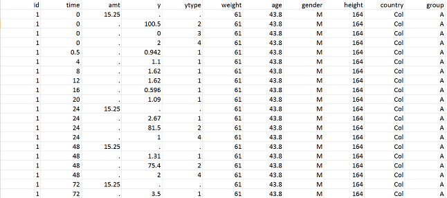 |
The datafile pkrtte_data.csv
|
We can read this datafile with the function readdatapx and add additional information about the data:
How we graphically represent data depends on the type of data. Often for continuous data we use "spaghetti plots", where all of the observations are given on the same plot, and those for each individual are joined up using line segments. Time-to-event data are usually represented using Kaplan-Meyer plots, i.e., an estimate of the survival function for the first event. In the case of repeated events, we can instead represent the average cumulative number of events per individual.
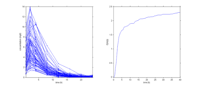 |
Graphical representation of the data. Left: concentrations, right: average cumulative number of events per individual
|
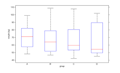
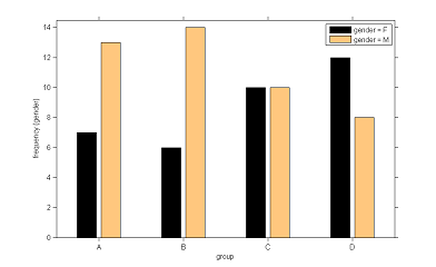
When different groups receive different treatments, it can be useful to separately visualize the data from each group. Here for instance we can separate the patients into groups depending on the initial dose given.
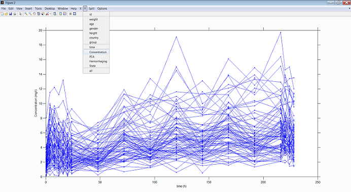 |
Concentration profiles per dose group
|
|
|
| Distribution of weight and gender per dose group |
Model exploration
Suppose that we now want to visualize the following joint model which is one that can be used for simultaneously modeling PK and time-to-event data:
Here, $A_d$ and $A_c$ are the amounts of drug in the depot and central compartments, $Cc$ the concentration in the central compartment and $h$ the hazard function for the event of interest (hemorrhaging for instance). The parameters of the model are the absorption rate constant $ka$, the volume of distribution $V$, the clearance $Cl$, the baseline hazard $h_0$ and the coefficient $\gamma$. We assume that the drug can be administered both intravenously and orally, meaning that the drug can be administered to both the depot and the central compartment.
We first need to implement this model using $\mlxtran$:
Here, an administration of type 1 (resp. 2) is an oral (resp. iv) administration.
The tasks, i.e., how the model is to be used, is then coded as an $\mlxplore$ project:
In this example, a single dose of 50 mg is administered orally (target=Ad when type=1) at time 0. We have asked $\mlxplore$ to display the predicted concentration $Cc$ and the hazard function $h$ between $t=0$ and $t=100$ every $0.1\,h$ for a given set of parameters. We can then change the values of these parameters with the sliders to see what the impact on the two functions is.
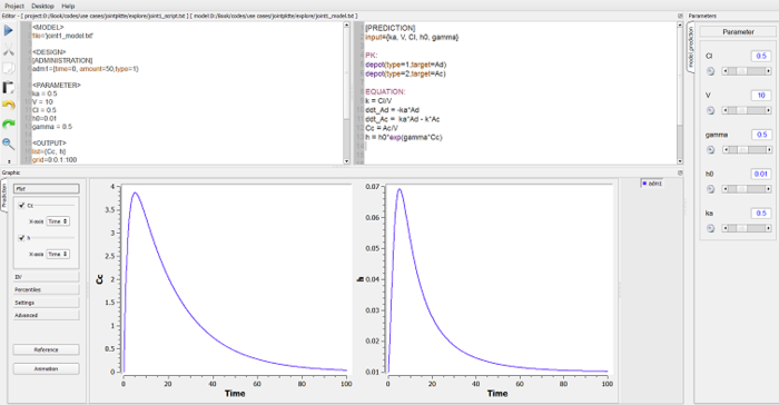 |
Exploring the model using $\mlxplore$
|
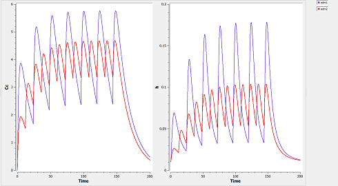
We can easily modify the dose regimen without changing anything in the model itself. Suppose for instance that we want now to compare a treatment with repeated doses of 50mg every 24 hours and a treatment with repeated doses of 25mg every 12 hours. Only the section <DESIGN> needs to be modified:
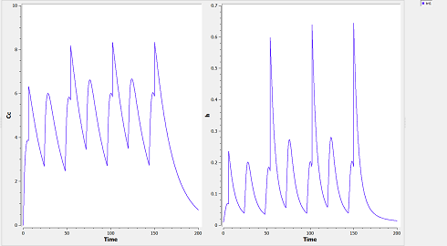
We can combine different administrations (oral and intravenous for instance) into one global treatment:
One of the main advantages of $\mlxplore$ is its ability to graphically display the predicted distribution of the functions of interest $Cc$ and $h$ when certain parameters of the model are assumed to be random variables. Assume for instance that $V$, $Cl$ and $h_0$ are log-normally distributed. To take this into account, we simply need to insert a section [INDIVIDUAL] into the project file:
The parameters of the model are now the population parameters $V_{\rm pop}$, $Cl_{\rm pop}$, $h0_{\rm pop}$, $\omega_V$, $\omega_{Cl}$ and $\omega_{h_0}$ and the parameters $k_a$ and $\gamma$ which have no inter-individual variability.
When some parameters of the model are random variables, $\mlxplore$ displays the median of the predicted distribution and several prediction intervals (the default is to use different shaded areas for the 10%, 20%, ..., 90% quantiles).
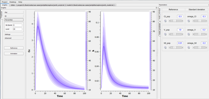 |
Exploring the statistical model using $\mlxplore$
|
It is possible to introduce covariates into the statistical model by considering for example that the volume depends on the weight, and considering that these covariates are themselves random variables. This may be important if we are for example looking to visualize the amount of variation in concentration due to variation in weight, and the variation in concentration which remains unaccounted for, caused by random effects.
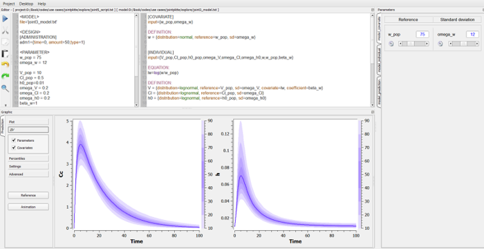 |
Exploring the statistical model using $\mlxplore$
|
